

Showing posts with label Inspiration. Show all posts
Showing posts with label Inspiration. Show all posts
Friday, 20 November 2015

Wednesday, 18 November 2015
Creative Journey (Digipak) - Michael

As part of my research and development for the creation of my digipak, I came up with many different ideas and took inspiration from many different sources and other forms of media that already existed. This document represents the 'creative journey' that I took to end up with my final media product.
In the top left hand corner of my creative journey piece, I have included three photos that broadly represent examples of 'Levitation Phototgraphy'. I have taken photos in this style in the past and found that they always have potential to look professional and intriguing. I was always interested in using this kind of photography when creating my own digipak so that I could give my own cover something interesting and a little different, so that it could stand out from the crowd..

The next section of my creative journey represents the stage in my planning where I decided that I wanted to include both band members on the front of the digipak. When planning my own digipak, I thought of albums I knew myself and liked with a theme of two people on the front, I took inspiration from albums such a Pink Floyd's 'Wish You Were Here' , Biffy Clyro's 'Only Revolutions', The White Stripes 'Get Behind Me Satan' and Fleewood Mac's 'Rumours'. These album covers played an important role in aiding when making a decision on whether to incorporate the band on the front of the cover.


In the top left hand corner of my creative journey piece, I have included three photos that broadly represent examples of 'Levitation Phototgraphy'. I have taken photos in this style in the past and found that they always have potential to look professional and intriguing. I was always interested in using this kind of photography when creating my own digipak so that I could give my own cover something interesting and a little different, so that it could stand out from the crowd..

The next section of my creative journey represents the stage in my planning where I decided that I wanted to include both band members on the front of the digipak. When planning my own digipak, I thought of albums I knew myself and liked with a theme of two people on the front, I took inspiration from albums such a Pink Floyd's 'Wish You Were Here' , Biffy Clyro's 'Only Revolutions', The White Stripes 'Get Behind Me Satan' and Fleewood Mac's 'Rumours'. These album covers played an important role in aiding when making a decision on whether to incorporate the band on the front of the cover.

After deciding I would use both band members on my cover, I got an idea from the White Stripes album, that I had already took inspiration from. On this famous album cover the duo are shown in front of a red curtain. This gave me the idea to find other albums featuring a similar theme. I found that Eminem's 'The Eminem Show' was very similar. I was so inspired by watching Kings of Leon's music video for 'Charmer', as is set in a sparse theater in front of a dark red curtain.

After finding inspiration in all of these different examples, I ended my creative journey by taking a photo that incorporated all of these visual styles. I used the photo I took, alongside some minimal text, to create a digipak cover I was proud of and that fitted into a genre I was aiming for.

Saturday, 24 October 2015
Digipak inspiration // Sachin Mistry

For my digipak I took some inspiration from ‘Years and Years’,
this is a band which I like to listen to but also their style of music videos
and also photography in terms of photoshoots and interviews suits our band
well. So for example the middle picture is of the band ‘Years and Years’, this
is a picture of a photoshoot they did for ‘COUPdeMAIN’ is a New Zealand based
music/lifestyle magazine, and they present the bands members/artists through a
polaroid which I think look good and goes well with our theme. Also the bottom
two images are of the ‘Ghajini’ Digipak which is a digipak of the songs from
the Indian movie. It had a similar theme where on the left hand side it had a
cut out of the border which is produced when you take pictures on an instant
camera. I liked this effect an implemented it into my digipak design. I did this
by creating an envelope which you can access on the left hand side of the
digipak which just like the one in the ‘Ghajini’ digipak. But unlike the other
digipak where it had a booklet I printed out individual photos of the band
members doing different poses. This is just like ‘Years and Years’ photos for
the magazine as they are also pulling random faces. I was going to writing on
the bottom of the photos like the ‘Years and Years’ photos but then when I slotted
then into the sleeve, the simplicity of then and the clean looks of the printed
photos looked better in my opinion.
With the actual photos I wanted a similar theme which ‘Years
and Years’ did, where they were against a neutral coloured background, and their
expressions and body language would be emphasised by the flash when taking
pictures. I achieved this look by setting the focus on my camera to automatic,
this is because I switched the lights of in the room so it was completely dark.
Then when the flash is triggered it would auto focus on the subject which are the
band members pulling faces. Before I turned the light off I made sure that I had
them in frame posing in the correct manner which I directing to do. Although we
had professional lighting in the room, by switching the lights off and taking
the picture I was able to create the shadow effect which is seen in the ‘Years
and Years’ photos as this gave a simple yet effect look as the flash light
would be solely on them and not bouncing off the walls. With the professional
box lights the aim is to eliminate shadows and to ensure correcting for
photoshoots, but I wanted to intentionally have shadows which kind of acts as
its owns filter on the photos which I really liked the look of.
Tuesday, 13 October 2015
Digipak Analysis - Digipaks I Own - Michael

King Krule - 6 Feet Beneath the Moon (2013)
When researching digipaks and the common conventions that they follow, I found King Krule's 2013 album, 6 Feet Beneath the Moon, very interesting. This album goes against many conventions as neither the front cover or the middle two panels contain any text. The only text is down the spine of the package and on the back cover, where the track listings are placed. The middle panels are filled with one long connected image of doodle appearing drawings, graphics and photos of random objects, such as plants and broken speakers all placed next to one larger image, in the corner, of Archy Marshall, otherwise known as King Krule, the artist of this album. He appears to b drawing in a book which makes it appear as that he has drawn the images on the middle two panels.
I am intrigued by the graphic design on this cover and would be very interested in doing something very similar when creating my own digipak. I am also very fond of the colour scheme used on this album, as it is very simple and minimal.the majority of the 4 panel pack is black and white except the background faded blue on the middle panels.

Cage the Elephant - Thank You, Happy Birthday (2011)
This digipak is one of my favorites that I own. The cover and inside panels are all graphic design and interest me greatly due to the abstract nature of the artwork included. The appearance of the font used and the drawings make the album seem as if they've been drawn on and annotated freehand. In contrast to the cover and the artwork the CD from the package is completely blank and stands out against the rest of the casing. I like the idea of the simplicity of this in comparison to the rest of the digipak.
I would like to incorporate certain features of this when creating my own digipak, such as the minimal CD in comparison to the rest of the chaotic cover and inlays. I would also like to incorporate certain types of graphic design in my own case as I feel that without it it may be lacking, I could use the drawings present on this album as inspiration. Although there is not a huge amount of text or variety in background colours, this digipak is not minimal due to the vivid and unusual drawings situated all over it.

Arctic Monkeys - Humbug (2009)
Another digipak I am very fond of is Humbug, by the Arctic Monkeys. Many of the covers and packs that I have looked at and took inspiration from have not included an image of the artist or band, however this cover appeals to me due to the nature of the photos used throughout the digipak. The initial cover photo appears not to be staged, but instead to natural. I like the idea of this as it goes against conventions and cliches of normal album covers. A photo that includes band members is also used on the inside covers and panels. An image of two band members climbing a hill is stretch across both of the inside panels. I really like this effect of a larger image being used to fill inside panels and will defiantly look at trying to use this when building my own digipak. Very little text is used throughout this digipak which inspires me to create a similarly minimal scheme as i find that minimal albums have a good effect on drawing in an audience.
Although the main layout for this digipak appears minimal, the colour scheme is not. On both the back and the front covers the colours are dull, faded and give of a 'retro' feel. The inside panels, however, do not sick to this scheme and use way more vivid colours that make the audience question the location of the image. This sense of mystery and questioning is inspiring and makes me want to incorporate questions into the imagery I use.

Drenge - Drenge (2013)
I have always been fond of Drenge album covers due to the fact that they rarely use text on the front covers of their albums or singles and because they use interesting photography or graphic design to style their albums. Their first debut album is my favorite. On the front and back covfers the same image of a graveyard is included. This image is interesting as it makes the audience think what thew image is representing. the colour scheme on the back and front is black and white, which seems grim and matches the "grungey" music that the band makes. This colour scheme doesn't continue to the inlays of the digipak. Unlike the outside of the package, the inside is bright and vivid and stands out due to three bright colours. this contrast is intriguing but I don't think I'll use this idea when creating my own digipak as I would prefer to keep a consistent layout.
Drenge are a English indie rock duo that are made up of two brothers. The graphic and image on the CD itself shows a photo of the brothers when they were younger. I find this idea equally as interesting and would certainly consider using older photos of the band members in my fictitious band.
Wednesday, 7 October 2015


Thursday, 1 October 2015

Digipack panel ideas - Milo O'mahoney


I like these three album covers due to their photographic merit. They have all employed techniques that create a professional style that matches what we are trying to achieve with our music video. I believe that if I adopt an album cover similar to one of these, it will match the video and style of music well.

Instead of a blank background or something bright i believe that a forest or some dark, natural landscape will go well with the proposed setting of the video. This will then be a good cross platform theme that remains similar throughout the album. I am planning on imposing three images (portraits) of the two band members (two of them individually and then one of them both together) with the forest or other natural setting in the background.

This is a similar style image to what i wish to recreate on the panels of my digipack. To get this style of portrait i will use a dark background and a single source of light to the side of the subject. This will create a smooth yet highly noticeable contrast between the two sides of the subject's face, which plays in line with our idea looking at the two sides of passion in our video.
Wednesday, 30 September 2015
Types of Music Video Research
Types of Music Video
There are many different types of music video, some tell a story and some aim to purely show a performance and some incorporate both aspects. When planning our music video we had to decide what type of video we wanted to create.
Narrative
A narrative music video is based around and tells a story and is sometimes referred to as a cinematic music video. Videos such as Green Day's 'Wake Me Up When September Ends' incorporates both performance and narrative aspects, but overall is based on a story and focuses on connecting with the audience through the narrative.

Performance
A performance video is exactly as it sounds, a music video that incorporates a performance aspect. These videos are very prominent in the indie and hip hop music genres, as usually the record labels for these categories dictate that the artist must be present in the video. Many videos in the music industry incorporate performance aspects, such as Arctic Monkeys 'I bet that you look good on the dance floor', which is entirely performance based.
Amplification
Amplification in a video is when the lyrics of meanings in the song link directly to the video. This is more common in pop genres as they tend to have younger audiences, and this video style helps them to understand the lyrical content. This is visible in Taylor Swift's 'We Are Never Ever Getting Back Together', when she sings "You called me up again last night", and an image of her on the phone appears on the screen.

Disjuncture
A disjuncture music video is a music video in which the lyrical content has no apparent link to the visual aspects on the screen. A good example of this is the band, Peace's, video for 'Lost on me'. Throughout the video the band members are seen dancing a set routine, which carries on throughout the entire video, which has no link to the audio or lyrical content in the song.

Friday, 25 September 2015
Setting choices.
With regards to where we are filming our video, we have several different areas in mind, they are:
 Rural-
 Urban-


Around half of the video will be set in the countryside or rural areas and will represent one side of our message. These shots will be daytime shots and will have happy undertones. We can achieve this by using bright, vibrant colours such as yellow and green. If we are lucky with the weather, the sky will be a nice blue and have few clouds adding to the complete happy mood of the setting.

Less than half will be filmed in urban areas, mostly during night time. They will have lonely and sad undertones and will work as the opposites of the rural shots. To make these undertones, darker colours will be used in tandem with the fact that at night most of the background will be dark or completely black. The clothing worn by the artists in the video will be black or grey. There will also be shots of fire as red and black compliment each other.
Indoors-
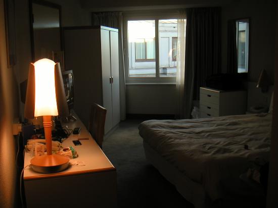
The remainder of the video will be shot in a bedroom. This will be a mix of happy and sad, with, at times, the two band members performing the song. At other times just t he main singer will be alone here. The colour scheme indoors will be similar to the shots in urban scenery with a greater focus on the contrast between light and dark. For example we will only shine a light on one side of the artist leaving the other side in complete darkness. The light, howevere, will have a smooth transition into darkness and will not be too bright or particularly coloured, maybe with an orange filter over the front.
Album cover inspiration - Milo

Artist: Frank Turner.
Album: Tape Deck Heart.
I like the literal design of this cover because it is something that only appears in 'indie' music. I also think that the colours compliment each other in a style that would work well, not just on a CD case or digitally, but also as a vinyl sleeve or poster.

Artist: Muse.
Album: Drones.
I like this album cover and it's political undertone that implies we are all 'drones' that have no free will. This is an idea that occurs frequently in muse songs and i believe it is inspired by the book '1984' as it is directly quoted in some of their songs.

Artist: Imagine Dragons.
EP: Continued silence.
Even though this is not an 'album' cover, artistically, it holds a lot of merit. I greatly wish to recreate this photographic technique for my own album cover as i believe it will work well with our song choice and concept that we are trying to convey.

Artist: Vampire weekend.
Album: Vampire weekend.
This album cover nicely recreates a scene that is common in indie music videos, or any music videos, a party. The thing i like about this particular design is that is does not focus on the party itself, just a meaningless object that is in the room. But it is still possible to guess what is going on slightly out of frame. I believe this is a very good and abstract use of composition that makes the cover look unique and memorable.
Wednesday, 23 September 2015
Album cover inspiration // Sachin Mistry

Album: Watch the Throne
Artists: Jay-Z and Kanye West
Reasoning: The reason why I like this album cover is because the design is symmetrical and eye catching as it isn't what you normally see on an album cover. To a normal person I do not think think that it represents anything, or anything to do with the songs, but I think the artist made this design for a reason. I really like the single colour used and the design is complicated yet attractive as it is almost mosaic. It is a little strange as it points you to the centre of the art but it is blank which is odd as the rest of the album cover is made up of this unique design. The artwork found on the cover of this album is actually from GIVENCHY BY RICARDO TISCI, which was slightly simplified as the original features flowers and given a gold makeover with a more 3D effect.

Album: Roaring 20's
Artists: Rizzle Kicks
Reasoning: A reason why I like this album cover, is because it is a sort of casual photo which you would take on your phone as they are out at night having a good time. I like how it is low in quality as this is the effect they are going for. Another reason for this choice is that the way that they have taken the photo with a bright light in front of them adds to the photos effect. The style of the photo is 'old fashioned' which appeals to me because it is a unique quality as most album covers these days are either basic or a high quality image of the artist/s.

Album: R8
Artist: Rihanna
Reasoning: I chose this album cover because I like the fact that the main picture of the artist isn't exactly centred and also it doesn't fill the entire cover as it is just a portrait of Rihanna. In addition to this, the effect of this album is that it is just a like someone has taken a picture of a printed photo. I like this effect because it gives the album cover a theme and sort of a authentic look. It almost looks like it is a police file of Rihanna as the photo is black and white, and sort of scruffy as it isn't in the centre and her name is written on the side. There is a binary code along the left hand side which music stand for something like the name of the album. There is also writing behind the photo which is kind of faint, this adds character to the cover.

Artist: FKA Twigs
Reasoning: This is a very unusual album cover, because FKA Twigs is posing in a weird way. She has photo shopped her hand into her face which is weird, but this helps to grab people attention as it is seen as 'not normal' and therefore people will pay more attention to it rather than an album with the artist looking 'normal'. It is quite an interesting album cover which you don't see everyday. I like how it is plain and there is no text on the cover of her name or the album title, she has kept it simple yet eye catching using visuals instead of text.

Artist: Payola
Reasoning: I chose this album cover because I thin that it is really unique, there are no pictures on the cover and it is just text. It looks like a military document for some kind of project, but it isn't clear. I think that it could be a censored document which they used to censor out important information. Even though there is a lot of text on the album cover it is a simple design as it is a scan or a picture of the document. It seems like quite an important document but but it is unusual to have a document as an album cover. The word 'Desaparecidos' means disappear in Spanish, and the 'Payola' is a contraction of the words 'Pay' and 'Victrola' (LP record player), and entered the English language via the record business.
Thursday, 17 September 2015
Album Cover Inspiration - Max

Artist: Mumford & Sons
Album Title: Wilder Minds
I like this album cover as it is very
simplistic however could have deeper meanings. The name of the album 'Wilder
Mind' goes well with the image of the bench looking out onto the city skyline
at night. The styling of the name of the band and album name is subtle as the
text is small yet as it is white on a dark background it stands out from the
rest of the album cover.
The idea’s I may take from this album
cover is the simplicity of it all as this will fit well with the band and song
choice.

Artist: Johnny Cash
Album Name: American IV: The Man Comes Around
I like the look of this album cover as it is very simple but would stand out when on a shelf. The image of the man against the black background makes him stand out and suits the overall feel for the album. The bold white name of the album will mean that it will stand out compared to others as not many will go for this very simplistic layout.
The idea's I may take from this album cover is the large bold title on a solid colour background as I believe this would stand out well compared to others.

Artist: The Who
Album Name: Who's Next
I like this album cover as it shows the band all together in a rocky environment. This album cover is very different to many others as it is not a straight forward image of the band nor is it a designed piece, this makes it stand out from the rest and it will stick in somebodies memory when they see it. The name of the album is very faint and blends in with the background, this will have been a part of the design of the album, however, I feel that it should be bolder.
The concept I would take from this is the band being all together in an urban environment as I believe it would suit the look of the band.

Artist: The Ramones
Album Name: Ramones
I like this album cover as it shows the band together against a wall. This is similar to many other bands album art s it is common to have the band side by side against a wall or background. The size of the album name will draw the attention of any potential buyers, as it is white on a grey background, therefore it stands out.
The concept I would take from this album art is having the band together side by side, also the use of black and white would go well with the tone of the band.
Thursday, 10 September 2015
Band Members // Styling


We have chosen the song 'Spark' by Amber Run. For that reason we wanted to style our band around them. However, they have 5 members and we only want to use 2, so we came to the decision to also style our band around the indie/pop group,'Circa Waves'. They have more of a simple dress style, as it consists of t-shirts and jeans, similar to an 'indie' or 'skater' dress sense. They also wear more neutral colours which will work well with the song choice, as we want a consistent monochrome look for our video.
In our video we want to show a contrast between two lifestyles, one happy and content, surrounded by friends, and another, alone and depressed. We hope to show the emotion through the use of body movement and facial expressions alongside various filming techniques. Having a simple design style, with dull colours, will hopefully help to emphasize the song's emotions and lyrical content, meaning we can get the desired outcome of a contrasting and cinematic music video. The actor's, or band member's, clothing will play a large part in this, as the colours and style of their clothing will reflect their various moods at different times in the video.
Wednesday, 9 September 2015
Video Inspirations
Circa Waves - Stuck in my Teeth
Milky Chance - Flashed Junk Mind
Splsahh - All I Wanna Do
Swim Deep - She Changed the Weather
The Vaccines - I Always Knew
Tuesday, 8 September 2015
Band Logo // Sachin Mistry

Monday, 7 September 2015
Final Song Choice 'Amber Run - Spark'

For our final song choice, we made the decision we wanted to use Amber Run's 'Spark'. We made this decision as, when listening, we realised it allows for many concepts and themes to be placed into the video. We also thought that when trying to mold the style of the band around an indie/alt/rock style, this song fits into this genre well.


Sunday, 6 September 2015
Example of other text // Sachin Mistry
Here is a list of some example of text which we will be taking inspiration from. These songs are to help us decide along with the 20 song list which style of song we want to go for. This will then help us to style our band members so that they look the part in the music video that we will create.

For example the Foals are a band and we like their style of clothing which they wear in their videos. This picture is part of their music video called 'Inhaler'. We want to take elements from this music video particularly the way they dress, to give our video a sort of edge and unique quality which we are going for.
This is another example of the style of video we want to shoot. This particular video was produced by another media group from another school a year or two ago. We like this style of video because it is sort of a narrative based video where there is a story line and the lead singer is telling a story. Another reason why we like this video is because it is a cinematic video, this means that there is a big focus on the singers as well as the framing and the way each shot is filmed. We want to create an intense cinematic video which will emphasis our song choice and will hopefully create a relationship between the lyrics and the visuals and also the music and the visuals.
Subscribe to:
Posts (Atom)