

Wednesday, 30 September 2015
Types of Music Video Research
Types of Music Video
There are many different types of music video, some tell a story and some aim to purely show a performance and some incorporate both aspects. When planning our music video we had to decide what type of video we wanted to create.
Narrative
A narrative music video is based around and tells a story and is sometimes referred to as a cinematic music video. Videos such as Green Day's 'Wake Me Up When September Ends' incorporates both performance and narrative aspects, but overall is based on a story and focuses on connecting with the audience through the narrative.

Performance
A performance video is exactly as it sounds, a music video that incorporates a performance aspect. These videos are very prominent in the indie and hip hop music genres, as usually the record labels for these categories dictate that the artist must be present in the video. Many videos in the music industry incorporate performance aspects, such as Arctic Monkeys 'I bet that you look good on the dance floor', which is entirely performance based.
Amplification
Amplification in a video is when the lyrics of meanings in the song link directly to the video. This is more common in pop genres as they tend to have younger audiences, and this video style helps them to understand the lyrical content. This is visible in Taylor Swift's 'We Are Never Ever Getting Back Together', when she sings "You called me up again last night", and an image of her on the phone appears on the screen.

Disjuncture
A disjuncture music video is a music video in which the lyrical content has no apparent link to the visual aspects on the screen. A good example of this is the band, Peace's, video for 'Lost on me'. Throughout the video the band members are seen dancing a set routine, which carries on throughout the entire video, which has no link to the audio or lyrical content in the song.

Tuesday, 29 September 2015
Alcazar Band Member Biography - Hugo Jones & Tom Owen

Hugo Jones
- Vocals, Chorus Guitar and Keys/Electronics
- 6' 3"
- 6th December 1994
- Leicester, England

Tom Owen
- Band Member Biography - Hugo Jones
- 6' 2"
- 27th June 1994
- Leicester, England
Saturday, 26 September 2015
Equipment for our music video

The Nikon D7200 is the camera we are using to film our music video. It is able to capture full 60fps, 1080p video, although we will most likely film at 24fps as this will give a sort of cinematic blur that is used in almost all movies.

In some scenes we will be using a tripod to gain clear shots that have no hand shake. This will not be possible for all our shots as we do not have a filming tripod (they have a smoother movement so you can track easily) as they are more expensive and very specialist. however, a photography tripod will be all we need to get the most important shots and any static ones easily.


This handle grip will be useful for acquiring any low angle shots or movement shots that require the cameraman to follow the subject whilst minimizing camera shake. It will also be used on some occasions with the skateboard to create a smooth movement. For example we have one scene planned where the subject is running, and instead of having the camera shaking, running alongside, the cameraman can get on the skateboard and roll smoothly next to him.
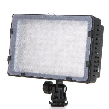
This LED lamp is what we will use to light up the subject in darker shots, whether it is attached to the camera directly or is in a static position somewhere out of shot. One particular scene we have in mind has the subject sitting down and the lamp lighting up only one side of his body/face and having the camera facing him so that the contrast is easily noticeable. We believe that this will add to our aim of making a 'cinematic' and professional looking music video.

We intend on using a speaker similar to this to play the song 'Sparks' by Amber Run so that lip syncing is easier for our artists. That and getting the correct timing will make editing afterwards much easier and will ensure a professional finish in our final product.

Friday, 25 September 2015
Weekly Update #3 - (21/09/15 - 25/09/15)

At the start of this week we analysed and evaluated all the feedback we got from our peers for the 25 word pitch which we made about our music video. This was a very important tasks as it has highlighted certain areas which we haven't mentioned which we didn't clear state in our pitch. An example of this is what style of video we are going to be making?
This week we started the storyboard which will help us to visualise our video better, this meant a lot of team effort, and collaborating off each other. I would say this has to be the activity I have enjoyed the most as we have had so many ideas for our music video. This also meant that that we have had to look at video and some movies which we have taken the ideas from to put into our music video.
We stripped our chosen song apart and so that we could analysis the song and find out what we think the lyrics mean. This is so that we can film scenes which are relevant to the song and make sure we get the message across through our music videos.
Camera Shots
Camera Shots
In our music video we plan to use a wide variety of different camera shots to express many different emotions, feelings and scenes throughout the video.
We looked at the original video for the song when choosing camera shots for inspiration.
Close up shots are used to connect the audience to the actors, characters or band members in the video. Theses shots help to connect the audience through creating an interaction between them. The audience is able to clearly see the face of a character in the video, and because of this are able to see the emotions they are feeling. In the original video, for 'Spark' by Amber Run, the chil in the video expresses many emotions. These are presented to the audience very clearly through many close up shots.

Long shots are used in a different way to close up shots, as the camera is positioned much further back and the shot shows the whole body of a character, not only just a face. These shots are important when setting the scene. Long shots set the scene as the audience is able to see where the character is situated. These shots can also show the emotion of the camera through the use of body positioning. Foe example, if a character is slouched, or has their head down as they walk, this could represent that they may be feeling down, or could be deep in thought. In the original video, for 'Spark' by Amber Run, long shots are used to differentiate the size between the two characters in the video, the child and the cardboard robot. In this particular shot, the long shot also sets the scene as it shows the audience that they are located in an empty house.

Other than long and close up shots, there are lots of alternate shots that we may use, such as mid shots, which are a mix o the two, as it connects with the audience and can still set the scene.
We will also vary the shots we take through the use of angles. High angled shots look down on the character, whilst low angled shots look up at them. When combined with different types of shot both of these angles can be useful for many different reasons,
Setting choices.
With regards to where we are filming our video, we have several different areas in mind, they are:
 Rural-
 Urban-


Around half of the video will be set in the countryside or rural areas and will represent one side of our message. These shots will be daytime shots and will have happy undertones. We can achieve this by using bright, vibrant colours such as yellow and green. If we are lucky with the weather, the sky will be a nice blue and have few clouds adding to the complete happy mood of the setting.

Less than half will be filmed in urban areas, mostly during night time. They will have lonely and sad undertones and will work as the opposites of the rural shots. To make these undertones, darker colours will be used in tandem with the fact that at night most of the background will be dark or completely black. The clothing worn by the artists in the video will be black or grey. There will also be shots of fire as red and black compliment each other.
Indoors-
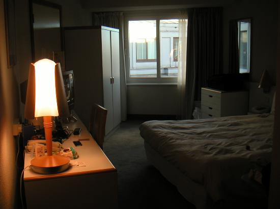
The remainder of the video will be shot in a bedroom. This will be a mix of happy and sad, with, at times, the two band members performing the song. At other times just t he main singer will be alone here. The colour scheme indoors will be similar to the shots in urban scenery with a greater focus on the contrast between light and dark. For example we will only shine a light on one side of the artist leaving the other side in complete darkness. The light, howevere, will have a smooth transition into darkness and will not be too bright or particularly coloured, maybe with an orange filter over the front.
Album cover inspiration - Milo

Artist: Frank Turner.
Album: Tape Deck Heart.
I like the literal design of this cover because it is something that only appears in 'indie' music. I also think that the colours compliment each other in a style that would work well, not just on a CD case or digitally, but also as a vinyl sleeve or poster.

Artist: Muse.
Album: Drones.
I like this album cover and it's political undertone that implies we are all 'drones' that have no free will. This is an idea that occurs frequently in muse songs and i believe it is inspired by the book '1984' as it is directly quoted in some of their songs.

Artist: Imagine Dragons.
EP: Continued silence.
Even though this is not an 'album' cover, artistically, it holds a lot of merit. I greatly wish to recreate this photographic technique for my own album cover as i believe it will work well with our song choice and concept that we are trying to convey.

Artist: Vampire weekend.
Album: Vampire weekend.
This album cover nicely recreates a scene that is common in indie music videos, or any music videos, a party. The thing i like about this particular design is that is does not focus on the party itself, just a meaningless object that is in the room. But it is still possible to guess what is going on slightly out of frame. I believe this is a very good and abstract use of composition that makes the cover look unique and memorable.
Thursday, 24 September 2015
Facebook Page // Sachin Mistry

I have created a Facebook Page for our band, this will help us to gain more recognition for the band because we can all share the page and get more people to see our band and recognition for the band branding as well. This will be used similarly to how we use twitter as we will be sharing information exclusives and any other information and updates about the band on this page.
Meaning of the video

Throughout our video we have scenes of fire, this represents passion. The music video which we will create is trying to attempt to illustrate passion throughout different stages of emotion. The two that were focusing on are happiness and loneliness. Most people associate passion with happiness and love for example, but we believe that you can be passionate in solitude and sadness, this is what we are trying to convey with this video.
Wednesday, 23 September 2015
Album cover inspiration // Sachin Mistry

Album: Watch the Throne
Artists: Jay-Z and Kanye West
Reasoning: The reason why I like this album cover is because the design is symmetrical and eye catching as it isn't what you normally see on an album cover. To a normal person I do not think think that it represents anything, or anything to do with the songs, but I think the artist made this design for a reason. I really like the single colour used and the design is complicated yet attractive as it is almost mosaic. It is a little strange as it points you to the centre of the art but it is blank which is odd as the rest of the album cover is made up of this unique design. The artwork found on the cover of this album is actually from GIVENCHY BY RICARDO TISCI, which was slightly simplified as the original features flowers and given a gold makeover with a more 3D effect.

Album: Roaring 20's
Artists: Rizzle Kicks
Reasoning: A reason why I like this album cover, is because it is a sort of casual photo which you would take on your phone as they are out at night having a good time. I like how it is low in quality as this is the effect they are going for. Another reason for this choice is that the way that they have taken the photo with a bright light in front of them adds to the photos effect. The style of the photo is 'old fashioned' which appeals to me because it is a unique quality as most album covers these days are either basic or a high quality image of the artist/s.

Album: R8
Artist: Rihanna
Reasoning: I chose this album cover because I like the fact that the main picture of the artist isn't exactly centred and also it doesn't fill the entire cover as it is just a portrait of Rihanna. In addition to this, the effect of this album is that it is just a like someone has taken a picture of a printed photo. I like this effect because it gives the album cover a theme and sort of a authentic look. It almost looks like it is a police file of Rihanna as the photo is black and white, and sort of scruffy as it isn't in the centre and her name is written on the side. There is a binary code along the left hand side which music stand for something like the name of the album. There is also writing behind the photo which is kind of faint, this adds character to the cover.

Artist: FKA Twigs
Reasoning: This is a very unusual album cover, because FKA Twigs is posing in a weird way. She has photo shopped her hand into her face which is weird, but this helps to grab people attention as it is seen as 'not normal' and therefore people will pay more attention to it rather than an album with the artist looking 'normal'. It is quite an interesting album cover which you don't see everyday. I like how it is plain and there is no text on the cover of her name or the album title, she has kept it simple yet eye catching using visuals instead of text.

Artist: Payola
Reasoning: I chose this album cover because I thin that it is really unique, there are no pictures on the cover and it is just text. It looks like a military document for some kind of project, but it isn't clear. I think that it could be a censored document which they used to censor out important information. Even though there is a lot of text on the album cover it is a simple design as it is a scan or a picture of the document. It seems like quite an important document but but it is unusual to have a document as an album cover. The word 'Desaparecidos' means disappear in Spanish, and the 'Payola' is a contraction of the words 'Pay' and 'Victrola' (LP record player), and entered the English language via the record business.
Tuesday, 22 September 2015
Amber Run - Spark song Lyrics
To create a good and enjoyable music video to watch and one that fits with the genre of our band we need to understand the meaning of various lyrics, this will help us create a video that works with the lyrics. This song 'Spark' by Amber Run can be interpreted in many different ways, we have decided film in a disjuncture style this means that the lyrics do not correlate with the music video, however during the chorus the scenes change in time with the song.
First it's the spark and then it's the flame
Then it's swinging round round lamp posts in the rain
Well then it's that feeling that you, you just can't shake
That your life's about to start and you just can't wait
First it's the spark and then it's the flame
Then it's getting blind drunk in the middle of the day
And though it's a comma in a full stop's place
It's that wherever I go I see your face
Oh, paper skin
I'm gonna love you, I'm gonna love you now
Let the light in, let the light in
Let the light in, let the light in
Let the light in, let the light in
Let the light in, let the light in
First it was fun now it's fireworks
Was so bright and so harsh that they'll make your eyes hurt
Oh it's the circles of smoke from your cigarette
Oh it's the beating of drums in the back of your chest
Oh yeah...
Oh, paper skin
I'm gonna love you, I'm gonna love you now
Let the light in, let the light in
Let the light in, let the light in
Let the light in, let the light in
Let the light in, let the light in
[x2]
Monday, 21 September 2015
Group Member Roles
In our group we have 4 members, we have assigned ourselves roles in the process of creating of our music video. This is because we all have different strengths and therefore assigning people to their strengths will help us create the best music video we can. Each role is very important and has a pivotal part to play when we film and edit out music video.
Max - I am playing a part in the music video by acting as the lead singer of the band, this is important as we need a person which will fit the style of our video well, and I am not really camera shy so I don't mind being in the video. Without the actor the music video would not star any people and therefore would not be appealing to watch.
Michael - He is the stylist of the group and also he is the main camera man, this means that he will arrange what the actors (Max and George) the band members, will wear during the different scenes in the music video and the test photo shoot. This is important as having a good stylist means that we can get into the genre of music we are filming, Indie Pop Alt Rock. Michael will help the band members look the part be able to relate to other bands that also play this genre and our audience.
Milo - He is the director and secondary camera man, the director is involved with how the video is shot, he is in charge of everything that happens when shooting the scenes.
Sachin - Sachin is the main editor for the music video in post production but he is also a secondary camera man, for the B-roll which we need if necessary. Also he will be helping Milo setting up the camera and filming the music video. He has drawn the storyboard and therefore he knows how the we will be filming the video and will help direct us.
Saturday, 19 September 2015
Friday, 18 September 2015
Weekly Update #2 - (14/09/15 - 18/09/15)

This week I would say that we have been very productive, as we finalised the name of our band, which was the focus over the weekend. This is because last week we came up with the band logo but wasn't sure on the band name, as we weren't sure whether it matched our genre of music and the style we are going for.
The pitch was also a main priority, as we had to be ready by the end of the week so that we could present our idea to the rest of the class. We used an online service called Animoto which helped us create a short little video explaining our music video idea, our audience we are aiming for and the style of our video. This was a big task because we had to think ahead slightly to make sure that we have all the details of our music video.
We organised a photo shoot for our band members as a test to see if the people we have selected to be featured in our band, suit the role or not. we were originally going for a four people band , but the we decided to have a duet instead.
Album Cover Inspiration - Michael

Artist: Moose Blood
Album: I'll Keep You in Mind, From Time to Time
I am inspired by this album cover as I like the style and simplicity of it. I will use this album cover as inspiration and for ideas when I create my own digipak. The image of the campfire and the girl behind it will also match scenes in our video, as we will plan to use videos of youth around a bonfire. I also like the minimalism of the sans-serif small white font, I will defiantly incorporate aspects of this cover on my own.

Artist: Eagulls
Album: EAGULLS
I like this cover as I am drawn to the grittiness of the image used in the background. The logo of the band is also placed on the cover, I like this feature as the logo is quite simple and doesn't distract too much from the image. This cover inspires me to use images that don't incorporate the band members on my cover.

Artist: James Blake
Album: Overgrown
This album cover intrigues me and also inspires me to involve band members in my cover. The photo of the artist, stood in the snow with smoke behind him, intrigues me as it gives away nothing to reveal the type of music on the album. There is also no obvious title or artists name on the front, which draws in a potential buyer to pick it up and look more closely. This album also is quite simplistic due to the lack of font on the cover. This inspires me as it makes me think of whether to include text in my cover or not.
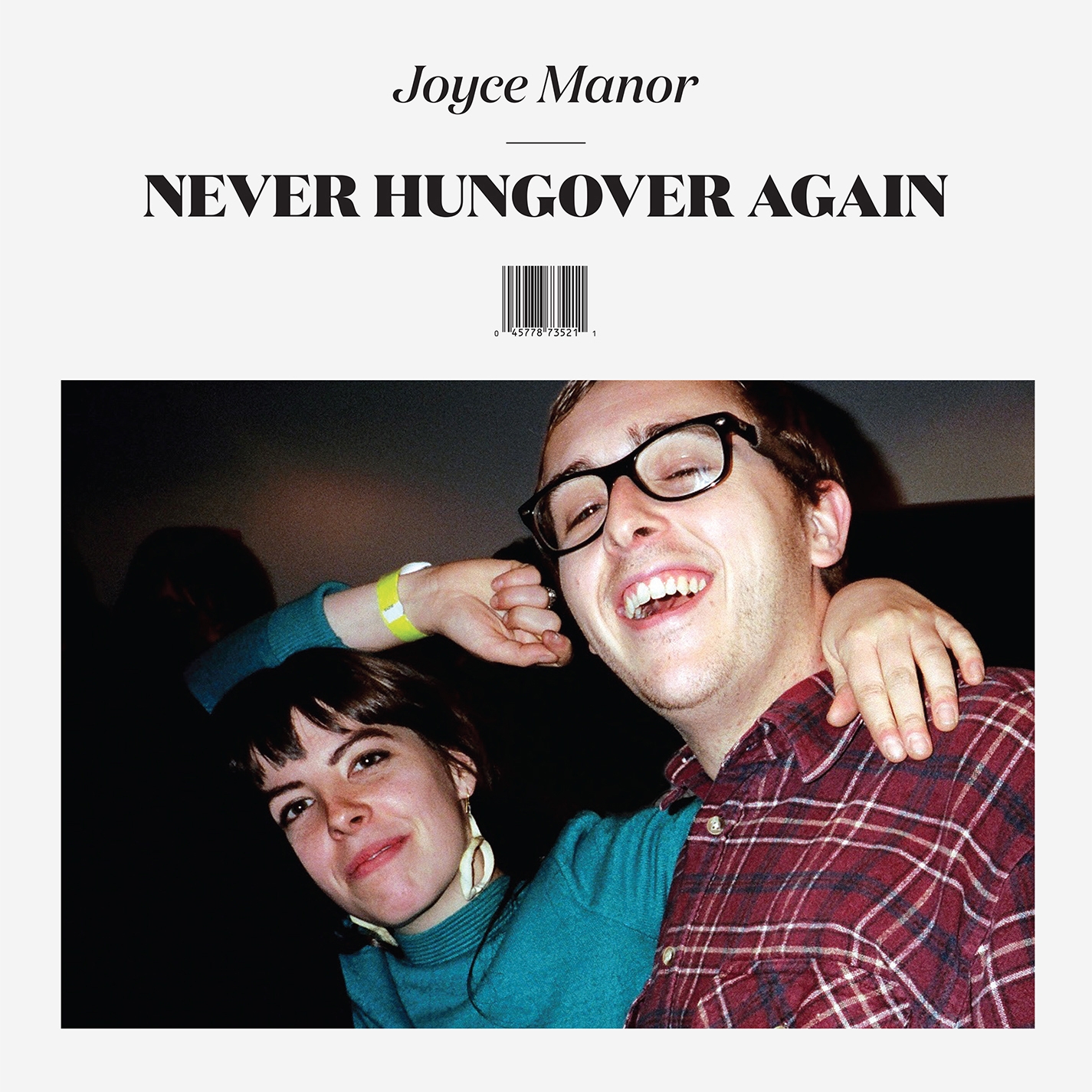
Artist: Joyce Manor
Album: Never Hungover Again
I like this cover as, similarly to the rest, it follows a minimal style. This cover is interesting as the bar-code and title of the album appears to be like a magazine. I like the font used in this cover and would like to use something similar, but maybe without the magazine appearance.

Subscribe to:
Posts (Atom)