
Showing posts with label band. Show all posts
Showing posts with label band. Show all posts
Monday, 18 January 2016
Sunday, 17 January 2016

Friday, 15 January 2016


Saturday, 31 October 2015
Weekly Update #8 (26/10/15 - 30/10/15)

I think that this week was very successful in terms of content which we uploaded to the blog and also in terms of productivity. This is because we have all posted out drafts of our digipak and magazine advert.
This also meant that the research and planning which we have conducted over the previous week was finalised so that we could create our 1st draft versions by the end of this week ready for the teacher to mark. We all got this done on time which is great, and because this was an individual task we have all made different digipaks and magazine adverts which you can tell as we all have different styles when it comes to things like this.
Wednesday, 28 October 2015

Tuesday, 27 October 2015


Monday, 26 October 2015


Saturday, 24 October 2015
Weekly Update #7 (19/10/15 - 23/10/15)

This week we we decided what types of digipaks we were going to make. Me (Sachin) and Michael planned on making our digipak using a template which we found online from disk wizards. We both are making 6 panel digipaks as we fell that it will suit our genre well.
The reason that I (Sachin) have chosen to create a 6 panel digipak is because it will entice the audience an draw them in as the digipak will be an experience in itself due to all the elements I want to include in this digipak. It will be the main source of information when it comes to song titles, and exclusive content which they will refer to and look at quite a lot and this is why I feel as though this will be sufficient.
Tuesday, 20 October 2015
Saturday, 17 October 2015
Weekly Update #6 - (12/10/15 - 16/10/15)

This past week has been busy, as we have all created our draft digipaks and adverts which we will hand in to get marked and receive feedback on. It was quite a challenging process because we used Photo Shop to create the digipaks and adverts which made the process slightly easier because we are all familiar with the software.
One thing that I (Sachin) found challenging, was the fact that we had to come up with an idea from all the research which we had done. This is because I found lots of amazing albums covers and wanted to implement little bits of then into one which came out slightly wrong. But I think that I have found a universal design which I am happy with.
I (Sachin) also conducted at the start of the week a font analysis, where I chose potential fonts which i could use in my digipak and advert to provide a universal theme across all of my products.
Saturday, 10 October 2015
Weekly Update #5 - (05/10/15 - 09/10/15)

This week we mainly focused on the research side of our coursework. This meant that we had to use the internet, books and other means to find out interesting ideas for our music video, digipaks and adverts.
I (Sachin) uploaded a blog post about why I chose to create a 6 panel digipak over other styles. I think that this was important because it is part of the research process. I feel as though a 6 panel digipak provides a better experience for the audience as there is more to look at and is more relatable to the band and the music video.
Another part of the research process was we all conducted a CD cover analysis, which meant that we had to pick three CD covers which we would take about for example the colour scheme, logos and how this is relatable to the band in some way. also how effective the album cover is at grabbing peoples attention.
I think that this was a successful week because we got quite a lot done in terms of the researching process.
Tuesday, 6 October 2015
Wavves Album Covers - Michael

Wavves are an American surf rock band from San Diego in California. They are notorious for their slightly eccentric and out of the ordinary album covers. Throughout the years they have used many different styles of covers to compliment their music, whether for an EP, album or single. They have used both photographs and graphic designs to cover their music, which interests me greatly. The three covers that incorporate images inspire me a lot, as all three images used are interesting to me and encourage me to take a similar photo for my cover.
Saturday, 3 October 2015
Weekly Update #4 - (28/09/15 - 02/10/15)

During this last week, we have started to plan where we will be film and taking photos for our digipak covers as well. We need to make sure that everyone can do the photo shoot together and because most of us want photos outside of school, we have had to make sure that everyone is free. we have also narrowed it down to some key filming spots which a good portion of our music video will be filmed.
Michael this week made a post on the audience biography which gives a brief summary of who they are and where they come from. We are treating this blog as if it is the official website for our band, and therefore we feel that posts like these are necessary. Max uploaded a post about risk assessment when film a music video and there can be some hazards.
As well as posting relevant research and weekly updates for our blog, we have use our official Alcazar Twitter page for our band, and on there we have tweeted sneak peaks of photo shoots, potential video and little things to keep our fans interested and up to date. We feel that it is necessary to keep people up to date with our band because they can always get the latest exclusively and do not have to find out from other sources first.
I made 3 posts this week about magazine adverts which I analysed, as part of my research. This was important because we could strip the adverts down and find out what works and what doesn't. This would also help us when making our own adverts for out digipaks.
Milo made a post this week also, about the equipment we will be using for the music video; for example type of cameras, software for post production, and small things like a skateboard which we will we will use along with a handle grip for the camera to achieve some smooth low and panning shots.
Thursday, 1 October 2015

Friday, 25 September 2015
Weekly Update #3 - (21/09/15 - 25/09/15)

At the start of this week we analysed and evaluated all the feedback we got from our peers for the 25 word pitch which we made about our music video. This was a very important tasks as it has highlighted certain areas which we haven't mentioned which we didn't clear state in our pitch. An example of this is what style of video we are going to be making?
This week we started the storyboard which will help us to visualise our video better, this meant a lot of team effort, and collaborating off each other. I would say this has to be the activity I have enjoyed the most as we have had so many ideas for our music video. This also meant that that we have had to look at video and some movies which we have taken the ideas from to put into our music video.
We stripped our chosen song apart and so that we could analysis the song and find out what we think the lyrics mean. This is so that we can film scenes which are relevant to the song and make sure we get the message across through our music videos.
Camera Shots
Camera Shots
In our music video we plan to use a wide variety of different camera shots to express many different emotions, feelings and scenes throughout the video.
We looked at the original video for the song when choosing camera shots for inspiration.
Close up shots are used to connect the audience to the actors, characters or band members in the video. Theses shots help to connect the audience through creating an interaction between them. The audience is able to clearly see the face of a character in the video, and because of this are able to see the emotions they are feeling. In the original video, for 'Spark' by Amber Run, the chil in the video expresses many emotions. These are presented to the audience very clearly through many close up shots.

Long shots are used in a different way to close up shots, as the camera is positioned much further back and the shot shows the whole body of a character, not only just a face. These shots are important when setting the scene. Long shots set the scene as the audience is able to see where the character is situated. These shots can also show the emotion of the camera through the use of body positioning. Foe example, if a character is slouched, or has their head down as they walk, this could represent that they may be feeling down, or could be deep in thought. In the original video, for 'Spark' by Amber Run, long shots are used to differentiate the size between the two characters in the video, the child and the cardboard robot. In this particular shot, the long shot also sets the scene as it shows the audience that they are located in an empty house.

Other than long and close up shots, there are lots of alternate shots that we may use, such as mid shots, which are a mix o the two, as it connects with the audience and can still set the scene.
We will also vary the shots we take through the use of angles. High angled shots look down on the character, whilst low angled shots look up at them. When combined with different types of shot both of these angles can be useful for many different reasons,
Setting choices.
With regards to where we are filming our video, we have several different areas in mind, they are:
 Rural-
 Urban-


Around half of the video will be set in the countryside or rural areas and will represent one side of our message. These shots will be daytime shots and will have happy undertones. We can achieve this by using bright, vibrant colours such as yellow and green. If we are lucky with the weather, the sky will be a nice blue and have few clouds adding to the complete happy mood of the setting.

Less than half will be filmed in urban areas, mostly during night time. They will have lonely and sad undertones and will work as the opposites of the rural shots. To make these undertones, darker colours will be used in tandem with the fact that at night most of the background will be dark or completely black. The clothing worn by the artists in the video will be black or grey. There will also be shots of fire as red and black compliment each other.
Indoors-
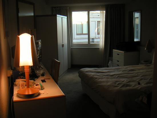
The remainder of the video will be shot in a bedroom. This will be a mix of happy and sad, with, at times, the two band members performing the song. At other times just t he main singer will be alone here. The colour scheme indoors will be similar to the shots in urban scenery with a greater focus on the contrast between light and dark. For example we will only shine a light on one side of the artist leaving the other side in complete darkness. The light, howevere, will have a smooth transition into darkness and will not be too bright or particularly coloured, maybe with an orange filter over the front.
Album cover inspiration - Milo

Artist: Frank Turner.
Album: Tape Deck Heart.
I like the literal design of this cover because it is something that only appears in 'indie' music. I also think that the colours compliment each other in a style that would work well, not just on a CD case or digitally, but also as a vinyl sleeve or poster.

Artist: Muse.
Album: Drones.
I like this album cover and it's political undertone that implies we are all 'drones' that have no free will. This is an idea that occurs frequently in muse songs and i believe it is inspired by the book '1984' as it is directly quoted in some of their songs.

Artist: Imagine Dragons.
EP: Continued silence.
Even though this is not an 'album' cover, artistically, it holds a lot of merit. I greatly wish to recreate this photographic technique for my own album cover as i believe it will work well with our song choice and concept that we are trying to convey.

Artist: Vampire weekend.
Album: Vampire weekend.
This album cover nicely recreates a scene that is common in indie music videos, or any music videos, a party. The thing i like about this particular design is that is does not focus on the party itself, just a meaningless object that is in the room. But it is still possible to guess what is going on slightly out of frame. I believe this is a very good and abstract use of composition that makes the cover look unique and memorable.
Subscribe to:
Posts (Atom)