Showing posts with label Sachin. Show all posts

Thursday, 21 January 2016

NOTE TO EXAM BOARD

We hope you enjoy looking at our joint group blog, and the journey we took to deliver our main and ancillary products.

please use the navigational search bar located to your right, or equally use the label cloud to refine your search too. 

Thank you,

Sachin, Michael, Max and Milo.

Thursday, 14 January 2016

Final Evaluation Question 1 // Sachin Mistry

In AS media one of out tasks where to create a magazine cover, contents and double page spread. I have decided to present question 1 as a double page spread. 

Cover: 

Contents: 

Evaluation question 1: Double page spread


Final Evaluation Question 2 // Sachin Mistry

For my final evaluation question 2 I have presented my answer on Pinterest.


The picture is a link which leads to my Pinterest account which contains the answer  to my Evaluation Question 2.

Or optionally read it below.

Final Evaluation Question 3 // Sachin Mistry

For my third evaluation question, I have created two video with my answers.

Part 1: - This is my full evaluation answer which I did a voice over for over our music video.


Part 2: - I conducted an interview with my target audience.


Final Evaluation Question 4 // Sachin Mistry

For the final evaluation question I presented the answer on my own website, please click on the link below to access the website.


Saturday, 19 December 2015

Draft Evaluation Question 4 // Sachin Mistry

How did you use media technologies in the construction and research, planning and evaluation stages?

I used a range of media technologies to help create my media products; this meant in the research and planning stages, production and also the evaluation stages. I used blogger in pre-production, production and post-production, this is because we used this medium to portray our ideas and reflect on others as well. In pre-production we used blogger for the research and planning so we would post the research we did on the blogs as a collated group blog. We labelled post so that they were easier to find and also help us to group our blog post together. So for example we all had to conduct an analysis on 3 music videos each so we create a label which we all used so that when clicked on it will take you to a filtered page with just our music video analysis on it.

We also used blogger during production as well. The way in which we used this was keeping the blog updated on the editing and filming process we went through as the filming was mainly done after school. Once we had the draft music video ready we uploaded it to Vimeo so that our peers and teacher could give us feedback on the video. We then published this to our blog so more people could see it and also making the feedback process easier as it has a build -in comment system which anyone can use. Likewise, we also used blogger to publish our draft and final versions of digipak and advert product, so that it could be see by other and also feedback would be welcome from our target audiences.

For post-production we used blogger for finishing off our coursework, this meant that when we had finished out media product we had some other task like our creative journey which is a mood board which shows the journey we took to get to our final media digipak and advert. We also published our draft and final version using different forms of media of our evaluation questions.

Pre-production: In the pre-production stage of my media product I used technologies such as Google Images, Tumblr and also a little of Google+. I used these technologies to help me explain my research by selecting images which suit my genre of my music for the video, digipak and advert. This is because I feel as if pictures also tell a story and it can also help to back up a point which I might be making about my target market.

For example I might have type something into the search engines and I could scroll through the pictures, this would help to come up with ideas for digipak and advert. I think that this is because when I found an idea which I liked I tried to create it which you can see in my creative journey which shows you how I got to this point. It inspires me to come up with similar ideas or use a combination of ideas in one style. When creating the storyboard for the music video and also planning for the photo shoot we looked at how other bands and also the types of people that would listen to our music would dress and style themselves. This is because styling and mise en scene also play a big part in trying to tell a story, as it becomes more realistic and desirable for the target audiences.
We used Adobe Premier Pro to create the animatic which would help bring our storyboard to life. This meant that we could see how to the scene we create would go along with the song which I thought was really helpful because if they were bits that we didn’t think go together then we could change in Adobe Premier Pro. We added the music over the top of the pictures of the song which we chose to make a music video for.

Production: During production we used two cameras and a camcorder. The first DSLR we used for filming was the Cannon EOS 100D We used this for the first half of the draft music video and then we rented the Panasonic HDC-SD90 for the second half of the music video. This was because it was smaller and had a better handle grip which we liked. It was more potable than the DSLR. But then when we edited the footage we saw that the low-light capabilities of the camcorder were not as good as the DSLR as the videos were grainy and as we were aiming to make a cinematic video it would look good if the shots where grainy. One of the members of the group bought a DSLR which was the Nikon D7200 Which better than the camcorder and the DSLR. So then all the camcorder shots were re-filmed with the Nikon and some of the Cannon shots were also re-filmed with this camera. The low-light capabilities of this camera where far superior to the camcorder which helped and made the video look much better than the original. I used the Cannon 100D to take the picture for the digipak and the advert.

Photo Shop was used to create out draft digipak and magazine covers. We did this by using the studio to take photos of the band members and then we could edit them in Photo Shop with affects, sizing, cropping and blurring etc. What I did was lay out the size of my page and then I made guidelines for the so that I could line up pictures and text properly on both my products. I measured a digipak as well so make sure that I got the measurements write, even though there are templates on line I found that they are all different sizes and when printer each of the panels are a couple millimetres short or longer than the other which I found odd so I made my own template.

Another form of media which we used was an instant messaging service called ‘WhatsApp’. This is because it helped us communicate with each other without going from one recipients thread to another to find out what they said and then inform the other person. We setup a group chat which lets each of us send text pictures and video which will then be received by everyone. I think that this as particularly useful because we were able to arrange when we can film as everyone could say when they are free to do so. There was a cancellation and this would also be easy to handle as they person who couldn’t make it can inform the group with a single message. We also used this instant messaging service to send each other pictures and video which would act as inspiration for the music, for example shots we might like in a video. Or pictures for our digipaks/adverts.

Post-production: We used Final Cut Pro X as our choice for editing and this played a large part in the product as well as the cameras. We used this because the UI (User Interface) was much better than adobe and also the screen which 21.5” widescreen instead of a square monitor which also made it easier as we could seem more elements of the software. I have never edited before until I started doing Media Studies as earlier on we had to make a Preliminary video which is where I learnt to edit, and within 20 minutes I knew what I was doing and could also help other because of how easy it was to use. with this software we were able to speed up clips and slow some of them down to help emphasise shots as well as make them more relevant to the time of the music as well. We could even change the white balance and colour of the entire clip if we wanted to. We also added text to the start of the video over the top of the fire scenes which we liked as it also helped us to emphasis the band and who they are.

An online program that we used was Vimeo. We used this to upload out video and then embed it onto our blog. This is because we were having trouble with the copyright claims of the song when uploading it to YouTube. With Final Cut Pro X, we would export the video and upload it straight from the editing software which was really helpful, and made the process evenly more seamless and effortless. By embedding it onto our blog our peers and others were able to see it and as it has a comment system we were able to receive feedback on it as well.

Friday, 18 December 2015

Draft Evaluation Question 3 // Sachin Mistry

What have you learned from your audience feedback?

Pitch: The pitch that we created was the first time that we actually received audience feedback from our peers. This was important because ours peers also fell into our target audience which our products are aimed at. We received feedback successfully as well as some areas which need to be address as questions were raised at some of our decision made by ourselves.
 We received a lot of praise for the way we wanted to film the music video as we aimed for a more ‘cinematic’ style video which looks good as well as tells a story. This is because in our pitch we mentioned the type of shot we want to include which will help to achieve  produce the cinematic video we want. People liked our song choice as well because they thought that it fits the genre of music we wanted to fit into, and the video we wanted to create for it. One question which was raised was that how will we accommodate for both genders as we aimed our product at both.
With regards to making the product appealing to both genders we took this into consideration and the ‘needs’ of the female audience, we believe that the romantic element of the song will also help to attract a mixed gender audience, without alienating any of them. Another question which was raised was the where we planned to film the main parts of the video; this is because on our pitch we didn’t mention any of location. As for the location we had to investigate the target audience more to make sure that the setting we chose is realistic and our video is a narrative .We then decided on having an open nature setting for half of the video, and an urban environment for the other half of the video. This is because we are trying to show how the character in the video we created, has happy moments portrayed in the day time, and depressing dark times in the dark/evening. Near the end of the video we have a flashback of all the good times that he has had with friends as music comes to its peak.
I feel that receiving feedback on our pitch was important because we could get real feedback from our target audience as they were our target market. It was important that they liked that idea as we would then know that our product which we wanted to create was going to be successful.

Digipak: When I handed in my draft version of my digipak, I received feedback from which I thought was important because I could improve on something which could help me when creating my final version. The feedback I received was mainly positive as people liked my idea and thought that it fits the genre of music we chose. However, I was given some small improvements which would make to make my final product they best it could be. One of these improvements was to include the songs of the back of the digipak. I felt as this was a fair comment as I thought that it looked good without the songs on the back and it was challenging convention. But then I realised that if I placed the song titles in a booklet which I also made for the digipak then the audience would find it hard to find them. Also normally when you are looking at a CD or digipak in stores you would normally look at the back to see the songs and to see if they are interesting. This is why I chose to act on the feedback and include them.

I was also advised to add the regulatory information which I did not include on my draft. This is because it is something that is found on most digipaks, and I would be challenging conventions of I didn’t include it. I could have kept the regulatory information off, as this would foreshadow the genre of then music as being simple and slightly mysterious as it wasn’t following the ‘norm’ which is an element of the music genre. I do believe that the changes that I made vastly improved the look of my digipak as it looks more realistic and could potentially be sold in stores. I enjoyed this process as I could see whether people liked my ideas or not, and it gave me confidence that my product would be well received by my audience if it was a real product.

Advert: As my advert was similar to my digipak as it contained the same images found on the album cover, it was also well received by my target audience as it received mainly positive feedback.
One comment which peers asked is about the white boarder being uneven on one side; this was an improvement because I was advised to make this the same all the way around. The reason that I did this is because I imagined this to be in a magazine which has a thick spin this means that they need a thicker… so that the text can still be read when opened. However, I did make this change because my peers said that it looked better without it and also if where to be published then they would be able to adjust the advert not me.

This was the only constructive criticism that I received; I liked this process because as my peers fit into my target market so it was a relief that they liked my product and there wasn’t too much to change. The feedback that I received helped me to improve my product and therefore crating the best product possible for my target market. As I have made these changes I know that it will be accepted by my target group.

Music Video: Looking back at our draft music video we did not receive any feedback, instead we received feedback on our final video. This meant that we weren’t able to make changes according to the comments as we had already completed out music video. But the comments we received on our final music video were mainly positive which means that it was quite successful amongst the target audience.

If there was any constructive criticism we cannot make any changes as it is too late but I think that it is still important to receive it because it determines whether they liked our final product or not. Some comments mentioned that the ending to our video was unclear. We have taken this on board and I think that the reason that the ending is slightly unclear is because there is a lot of fast pace action due to the flash blacks and then the music dies down and it is left with the lead character on his own in the dark. What we aimed to do originally is to make the character see as if he was going take his own life as it is quite a sad song and this explains the jump from happy to alone scenes and also the flash backs near the end, but then we decided that we wanted to make a little bit of a mystery. By doing this we would let the audience decide whether, the character walks away/tries to leave home or takes his own life.

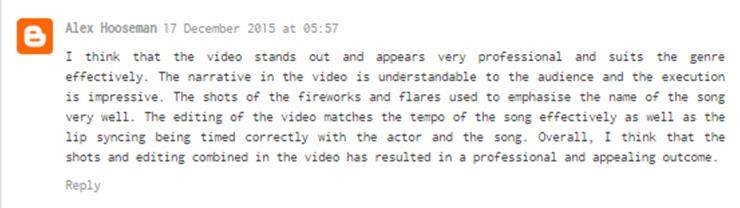
The good feedback we received was really a helpful and made us feel that our product was successful amongst the target audience. This is because people said ‘very effective’, ‘visually impressive’, ‘visual masterpiece’ and ‘stands out and appears very professional’. This was very helpful because they enjoyed our product which we made and we feel that if this product was to be presented to a larger group of people in our target market they would also like it and would be greatly accepted by the audience.

Although we didn’t receive feedback on our draft music video I think that it would have helpful because it could have made our video better and we could have made a definite ending to the video instead of leaving it at a cliff hanger. But I think that the decision we took was the right one as I think that it is interesting to see other people’s interpretations of the ending of the video. We did change a section of the draft music video mainly because we didn’t like how it was edited but also because of the feedback we received from our teacher.  

The feedback we received from our teacher was the source of the improvements which we used to make changes to our music video. For us this was important as it helps us to make sure that we were on track and on the right tracks for producing a high quality video product. For example some of the scenes which we used in the draft music video sir did not like because mise en scene didn’t fit the surrounding clips. We then acted on this and rearrange some of the scenes and moved to a move suitable area where it made more sense and fits in better. This helped our music video as we were able to make a more coherent story for our music video. Also another scene which we shot has wired lighting and made the subject which was in focus, the main character, a greeny yellow ting which he didn’t like. We agreed with this and re-filmed this scene with better lighting in a different room.

I think that overall though the audience feedback which we received was accepted and some we too action on which all in all helped to make our music video product that we could make. I was also able identify our strengths and weakness of the music video and act accordingly. I believe that feedback is important because if I didn’t receive any then I wouldn’t have been able to product the best product that I could make.  

Thursday, 17 December 2015

Draft Evaliuation Question 2 // Sachin mistry

How effective is the combination of your main product and ancillary texts? 

I feel like the combination of my ancillary text and the music video product are effective as they all tie into one, and are all relevant to the to each other so they are not all individual products.

When creating my digipak and magazine advert based the theme on the music genre which we had selected when choosing the song.  I feel that my digipak and advert fit well with the indie/rock genre which we wanted to base our band off of. This is because we had chosen song which has a lot of emotionally lyrics which we could present in the digipak. This is because the digipak is where the music will be stored and this will be the direct link which the audience will make. I similarly believe that my ancillary texts are simple which makes it easier to familiarise yourself with the band as there is not a lot of text or pictures surrounding the artists or the band name which helps with recognition of the band more easily. For example of my advert was on the side of the bus shelter in the city centre, I think that it would stand out because of the bright grey background which makes the members of the band stand out more. Also the contrast of the white lettering on the grey background also stands out amongst the crowd.  By doing this I wanted to create an image for the band that they are clean and simple and this would also translate into their music foreshadowing that they also have clean and simple music.

For my digipak I took inspiration form ‘Placebo’ and ‘Dirty Projectors’ this is because I liked the two shots they had because it looked very minimalist as they also had blank facial expressions. The inspiration from ‘Placebo’ came from one of their photos where they had all the band member faces over the top of each other almost like a fan. Even though it was a close up and majority of their faces was covered up you can still see their facial expressions which I thought was quite unique and ended up using this technique on the inside of my digipak. With my advert I used the same images found on my digipak but arranged then as in a different manner where they are bleeding over the border. This is because the majority of the ones that I found online feature the album cover and then some information at the bottom.  Didn’t feel as this would fit my theme and as I said previously f they features somewhere on display they would stand out due to the minimalism and people walking by could read the text quickly as the information I provided was quick and to the point.

With band branding I made sure that I used the band’s name on all three of the product, on the digipak I placed the band name ¾ of the way up the album cover around the eye line so that when the audience see the album cover they will make the direct eye contact and then they will see the band name. On the advert I placed the bane name at the top of the advert using the same font (Orator Std Medium) so that it is recognisable and clear to read. Likewise o the music video I placed the band name at the starting of the video so that if the video was accidentally clicked on as the least audience will know who the band right from the very start. If I were to do this again I would also make sure that the band’s logo is also loud and clear on all of my products as well to main continuity. For example I have the band logo on the spine and the back of the digipak, middle of the advert under the title so that the can familiarise the name with the logo and the band with the brand. But on the video I did not include this, so I would have a completely black screen with the band logo presented and then show the band name like normal. Or I could present it at the end o the video wither the credits. The name of the album is ‘Hard light’ and the lighting in the video was dark, quite bright at times and harsh. This reflects the name of the album and emphasises the link between the products. Also the pictures that were used as the exclusive pictures of the band members I took use the hard light effect as it represents the album name and it maintains continuity.

I think that the continuity of my digipak and advert links to the continuity of the music video showing that all of my work I planned thoroughly thought out before it was created. Each part of the digipak and advert have a meaning as to why I chose this deign language which reflects on the music video as each scene was planned out from the outfits to the mise en scene and the props in the background. The continuity of the video is that it’s always leading back to the lead singer and his memories going from good times with friends to bad times on his own. I believe that there is a direct link between all my products and that the band has been portrayed well which in my opinion is the most important when it comes to selling their products. 

Draft Evaluation Question 1 // Sachin Mistry

In what ways does your media product use, develop or challenge forms and conventions of real media products? 

Whilst creating my music video, digipak and advert, we first started my research booking for inspiration from other music videos, digipak and advert which other students have made and also professional media product. This was an essential part of the research process as it gave me an idea of what style we wanted to go for and how we wanted our media products to look. 

Digipak - For my digipak, whilst looking for inspiration I discovered some specific conventions which I tried to emulate as I thought would work really well as a concept in my digipak design. For my front cover there was a lot of going back and forth from design which I had seen on the internet and testing them out on my band members. But the album cover I kept going back to the 'Dirty Projectors - Bitte Orca.
This particular front cover caught my eye because of its simplicity and the ability to intrigue the audience as it did with me. I wanted my front cover to have the same effect on the audience and so decided to use a number of the conventions which feature on this particular cover. As on the background of the Dirty Projectors album, it features a simple grey background which I adopted and also used a grey background for the cover of my album cover as well. Also with this front cover the symmetry which has been used in this album cover caught my eye because the artists faces and their bodies lined up perfectly, which I like because it represented a sense of being too perfect with an album cover which I really liked the thought of doing. So when it came to creating my work, I used guidelines on Photoshop which helped me to achieve these perfectionate line on my digipak cover. When I positioned the text on my digipak cover I also used the guidelines for my media product so that the text was lined up perfectly.  

With my original cover, I used the original photo which hadn't been edited, as it I was simple and replicated the two shot of the Dirty Projectors albums. But when I made my draft magazine advert I noticed, as I used the same images, that because George (one of the band members) was standing slightly behind Max (the other member of the band) so what I did was cut them out in Photoshop and then also used the guidelines to enlarge George slightly so that the heads are the same size, along with their nose, eyes and chin level with each other. So I then used this technique on the front cover which made the cover pop more and it made everything even and in-line with each other.  
Advertising Magazine Poster - As I started to design the advertising poster for my band, I analysed a variety of existing poster which stretched from a wide range of genres. I did this instead of just looking at indie rock posters because I wanted to get a field of what some of the others look like and although they do not fit my theme I could incorporate some of the design elements which they might have used to create theirs. When looking at my other professional posters and ones that students made, I inspiration isn't that clear but what I did was mess around with the different layouts when I was making it on Photoshop. I knew I wanted to use my album cover on but didn't know how to implement it. I knew that I was going to have a white border and then I decided to cut out the band members because one of them looked out of place and small due him stand behind the other during the photoshoot. I then lined them up and positioned them behind each other as I tried to make it look as natural as the original photo, and then similarly like the draft album cover which I made I made the text centralised on the poster. I also included the band logo as well on the poster so that when audiences look at the cover they will instantly recognise the band or next time they see the logo they will recognise that it is Alcazar, because the band logo represents them as a brand as well as a band.  

Music Video - We watched videos from various different genres to make sure we were certain on our decision on the genre we wanted our song to be. We then looked at videos from Imagine dragons, Amber Run, The 1975 and the Milky Chance etc.. This helped us discover the type of video that we wanted to produce. At the start of the research for the making of the music video we knew that we kind of wanted to make a narrative/ illustrative video because we had a storyline in mind which we felt was really strong and wanted to convey this through the way we filmed, and the shots we used in the video.  

For our preliminary video we made a performance video of the 'Arctic Monkeys - I bet you look good on the dance floor,' I really liked the filming and editing process of this particular video but I wanted to make something more complex which had more meaning and can actually reach out the audience like a narrative video which makes sense and has a story line. We have quite a few fire scenes in our video which represents the 'Spark' or the 'light' in our video. I see the lights and the fire as a metaphor like a person, the person which is represented by the light is trying to help the boy who is feeling depressed, but they are also a reminder of the happiness which he used to enjoy and thrive in the moments with his friends.  

I feel like the music video which we made is not original but unique in the aspect that the scenes which we used to put this music video together really emphasis the meaning of the song and the lyrics. In addition to this, our video is different to the original as it is about a person who is so tired up in himself that he cannot share his feelings with anyone as he is full of anger, and it gets to the point where the robot is another part of him and actually hurts him in the end which represents him self harming.   

Monday, 30 November 2015

My Creative Journey Explained // Sachin Mistry

My initial ideas started with the band Placebo in the top right hand corner. I saw this image and was intrigued by the framing of the people and the different expressions they possess. As you can see to the right of this image I tried to duplicate this image but with a slight difference putting a twist on the image. I did this by creating a shadow on on of the band members but essentially making their faces brighter. I like this affect as it also emphasises my album title 'Hard Light' which was the effect that I was going for. The third image is also interesting as it is similar to the Placebo's photo but it is painted and likewise the faces are connected which makes the painting stand out more.


The next step was to establish a font, the one that you see at the top is the Orator Std Medium. The reason that I like this font is because of the larger than normal space in between the letters. Also I like how they are all caps as it brings a simplistic feels to the Album cover I like. The next one is Roboto Regular Condensed, this is also another simple font, and style of the letters are slightly bold which makes it easy to read and attractive to the eye. The third one down is the AR Bonnie Regular font, the reason why I liked this font is because of the way it looks slightly old fashioned but I don't think that it would suit our music genre too well. The last one is AR Blanca Regular which is an unusual font, as it is in italics and also it has quite an old fashioned theme to it sort of like calligraphy. 


Then I decided on a colour scheme which I could potentially use throughout my digipak. I then did some experiments with Max, as he was playing one of the band members and on a photo I took, from a photoshoot, I added a black and white filter which matched the colour scheme.At this point I spent some time looking at images of double exposure photos which I thought looked amazing, and the effect is as if the person is fading away. As you can see on the far right that I have tried this effect with Max and George, I fell like this could have been a goof idea for an album cover. Also when choosing images to 'overlay' on top of the original image I made sure that they where matching the colour scheme of the blacks, greys and whites. 


This is the Dirty Projectors album cover which I found when search for album cover inspirations, I have also analysed this album cover and said that I like the way that they have photographed a two because it looks like they are looking at each other and also as they have blank facial expressions it intrigues me as the font of the name of the band and the name of the album in small and situated in the top left and right hand corners. Below is a photo from one of the photo shoots I did and what I tried to do is recreate the photos, but as i took them from a higher angle I didn't quite like the look of photo. 


This is the 'Ghajini' digipak where I took my inspiration from. It is an indian movie and this is the sound track on CD presented in a digipak form. The reason why I like this is because the photos, specifically the polaroid like photos which I thought looked authentic. 


This is the side shot that I used for one of the panels in my digipak. The image to the right is edited with a sepia effect on it. I think that this looks good as it gives deep blues and orangey coppery colours which I really like. I then copied the same image over onto a Photo Shop page and started to experiment with the image. What I eventually did was smudge the image so that it looked like a brushed effect which became the background to the other two inside panels. If I could make changes I wish that I could use the edited image in my digipak as it would maintain the same colour scheme.


As you can see on the right the top image is of the band 'Years and Years' and these photos are form the interview by COUPdeMAIN a music/lifestyle magazine from New Zealand. I liked the idea of the polaroid which is a development from the 'Ghajini' digipak as these also include them. 


This is the colour scheme for my digipak,, and even though I has 6 colours I think that this is the main colours as these are the ones which attract the consumers attentions when looked at.


This is the splash hands which I created. I saw this effect on Tumblr and then I looked on YouTube for tutorials, and then made this hand image. I then tried to make this on Max who played the main character in the music video. 

This is the band logo that I created for the band and also for our group. I think that this represents us very well and also as I used this in our pitch our peers identified this and linked it to our band which is exactly what we wanted. 


This is the final digipak on the bottom right hand corner and the one to the left is the album cover. The image above and to the left of this is the image which I used and also edited in Photo Shop for my digipak album cover and advert.